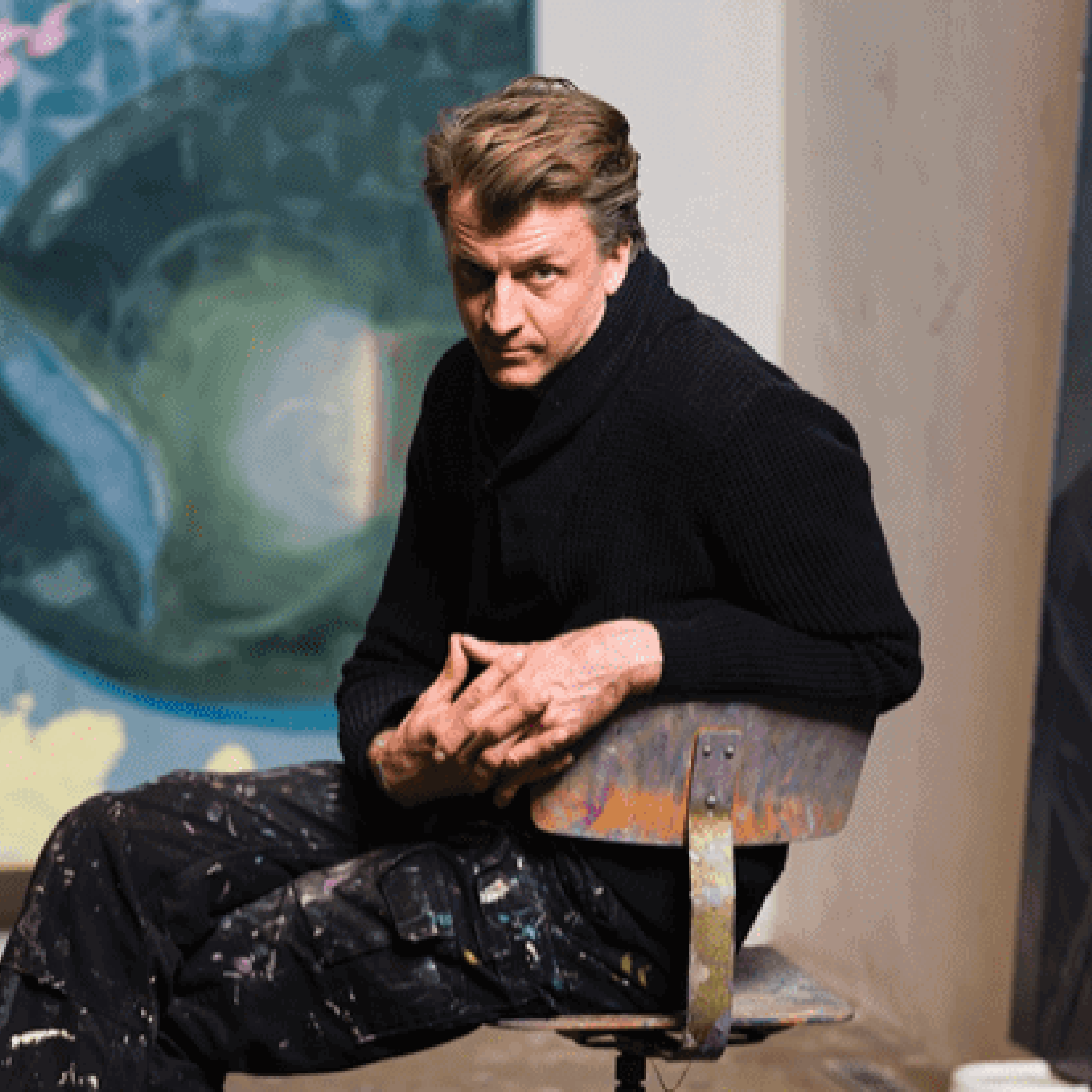
(Germany, b. 1974)


Ruprecht von Kaufmann Born in Munich, Germany, and a graduate of the BFA Los Angeles Art Center College of Design, Kaufmann has been associated with prestigious institutions like Berlin University of the Arts, Hamburg University of Applied Sciences, and Leipzig Academy of Fine Arts. Currently residing and working in Berlin, he is recognized as a prominent visual narrative artist. As an artist focusing on graphic storytelling, Kaufmann explores various facets of human experience through the visual language of contemporary painting. His work showcases critical narratives and parallel realms of reality. Exhibiting in major European cities such as London, Berlin, Stuttgart, Oslo, and New York, his pieces have found a permanent place in renowned collections, including those of the Hort Family in New York, Germany's Sammlung Philara Museum, and the National Bank of Germany in Frankfurt.

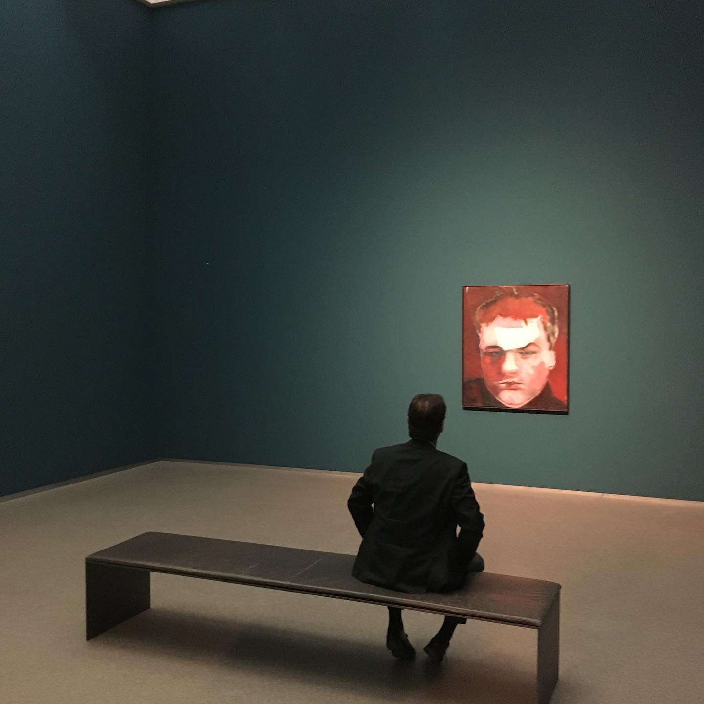
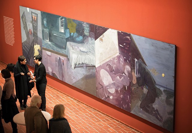
2019 Pinakothek der Moderne, Munich, Germany
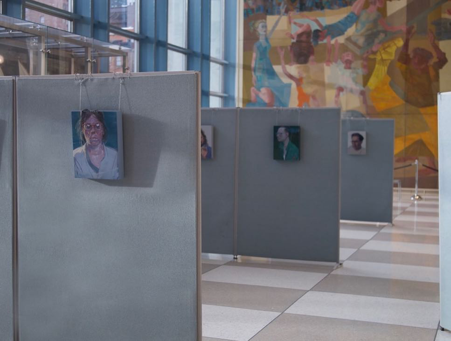

2019 `Inside the Outside´, UN Headquarters, New York
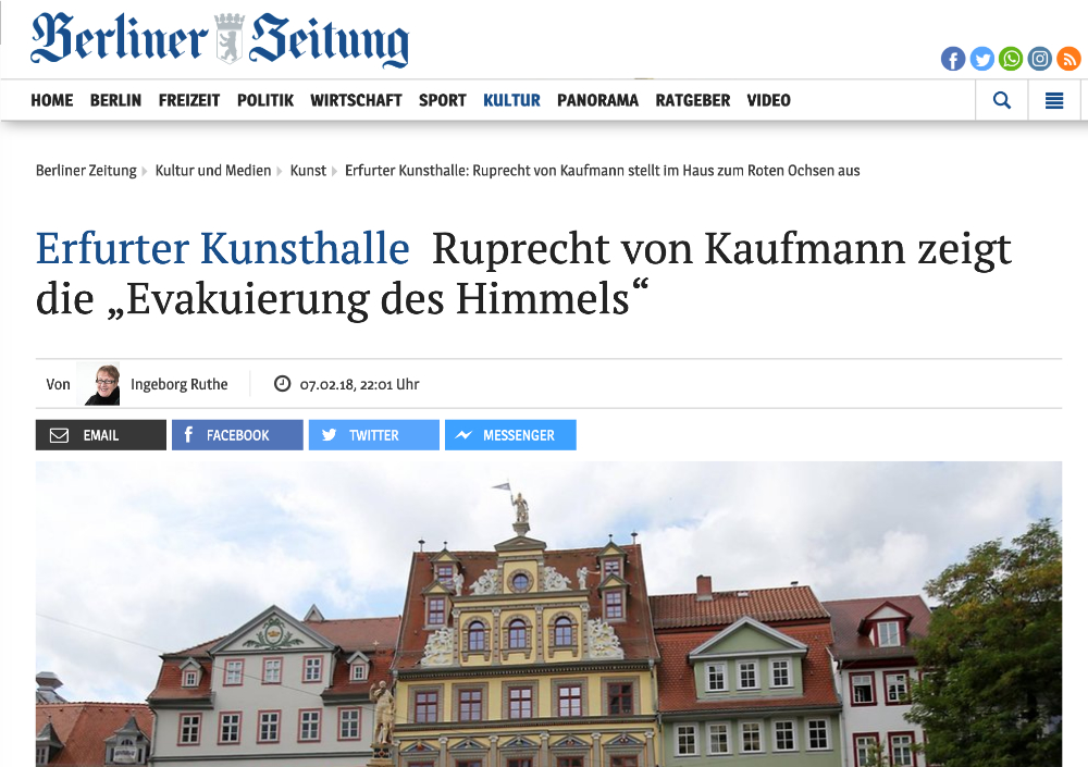
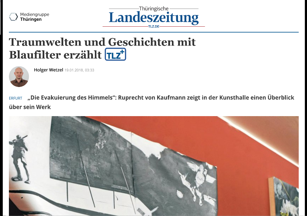
2018 `Die Evakuierung des Himmels´, Kunsthalle Erfurt, Erfurt

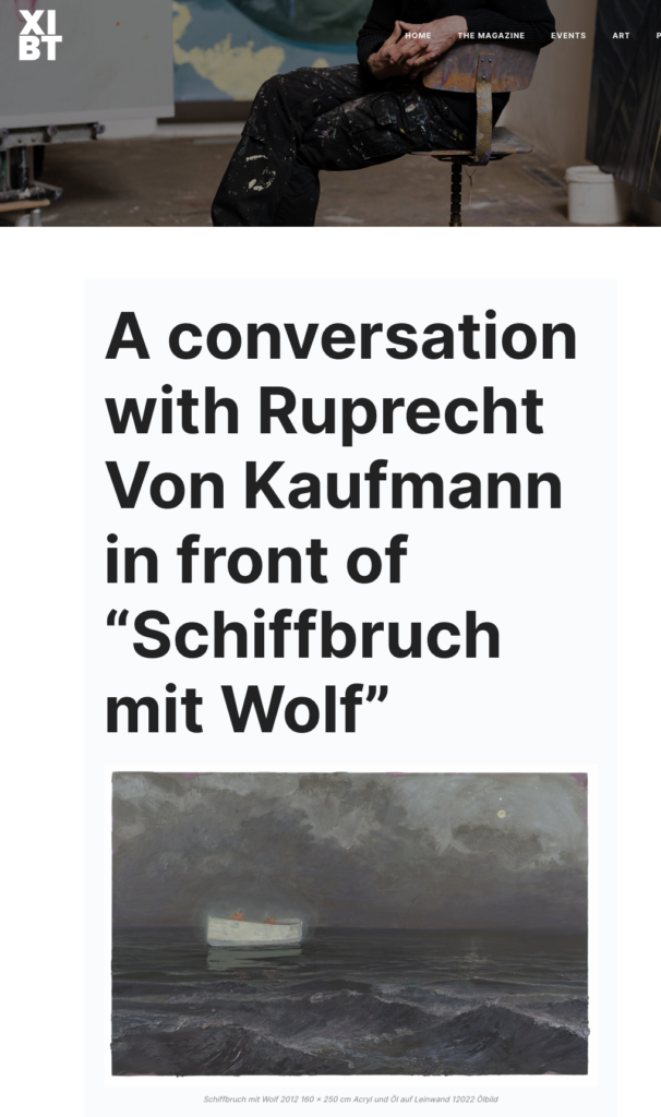
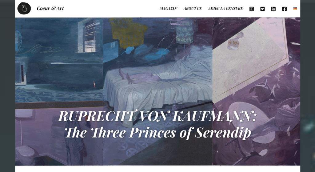
2019 “The three princes of serendip” Kunstsammlung Neubrandenburg
2017, Ecce Creatura Groupshow, Kallmann Museum, Ismaning


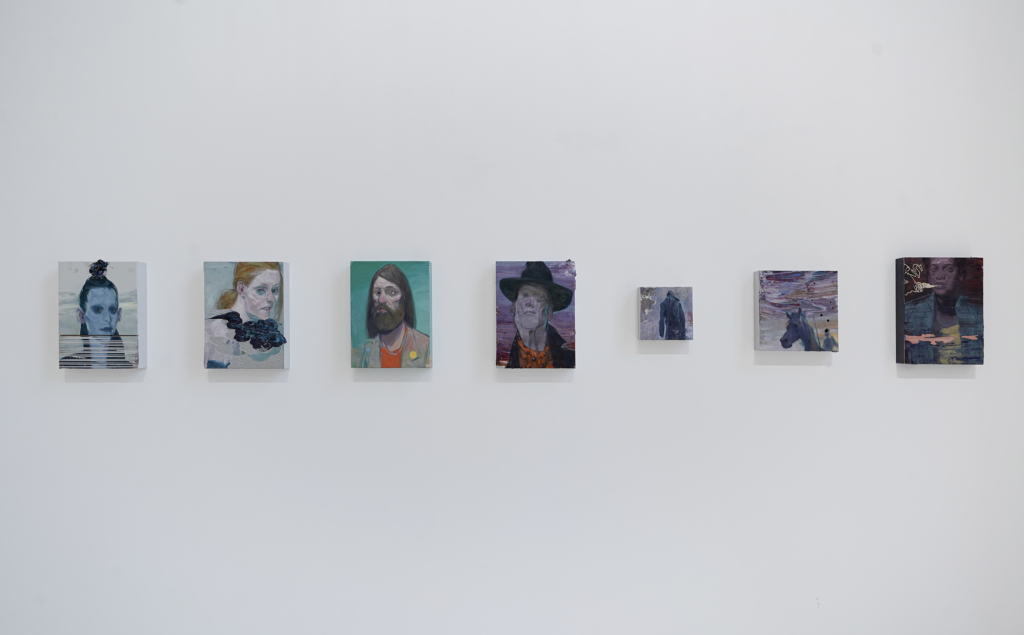
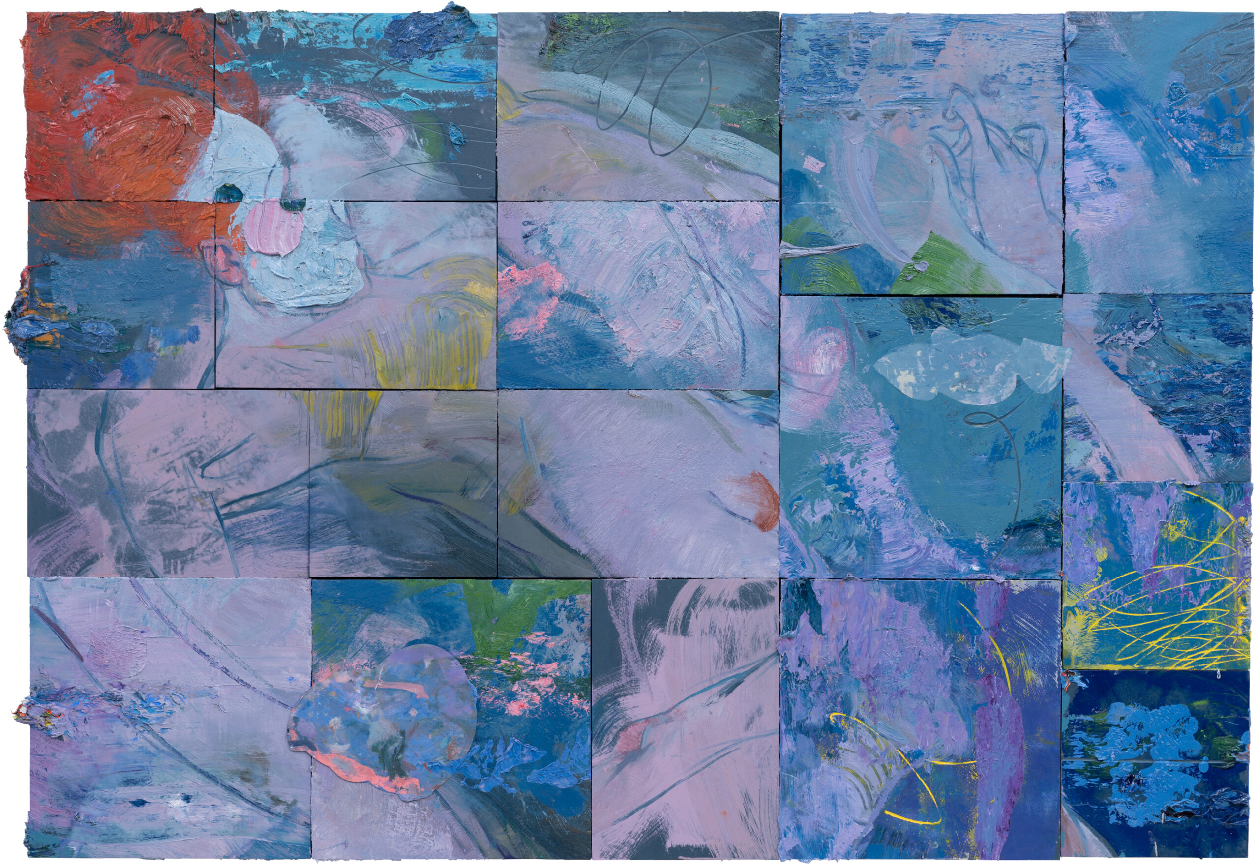
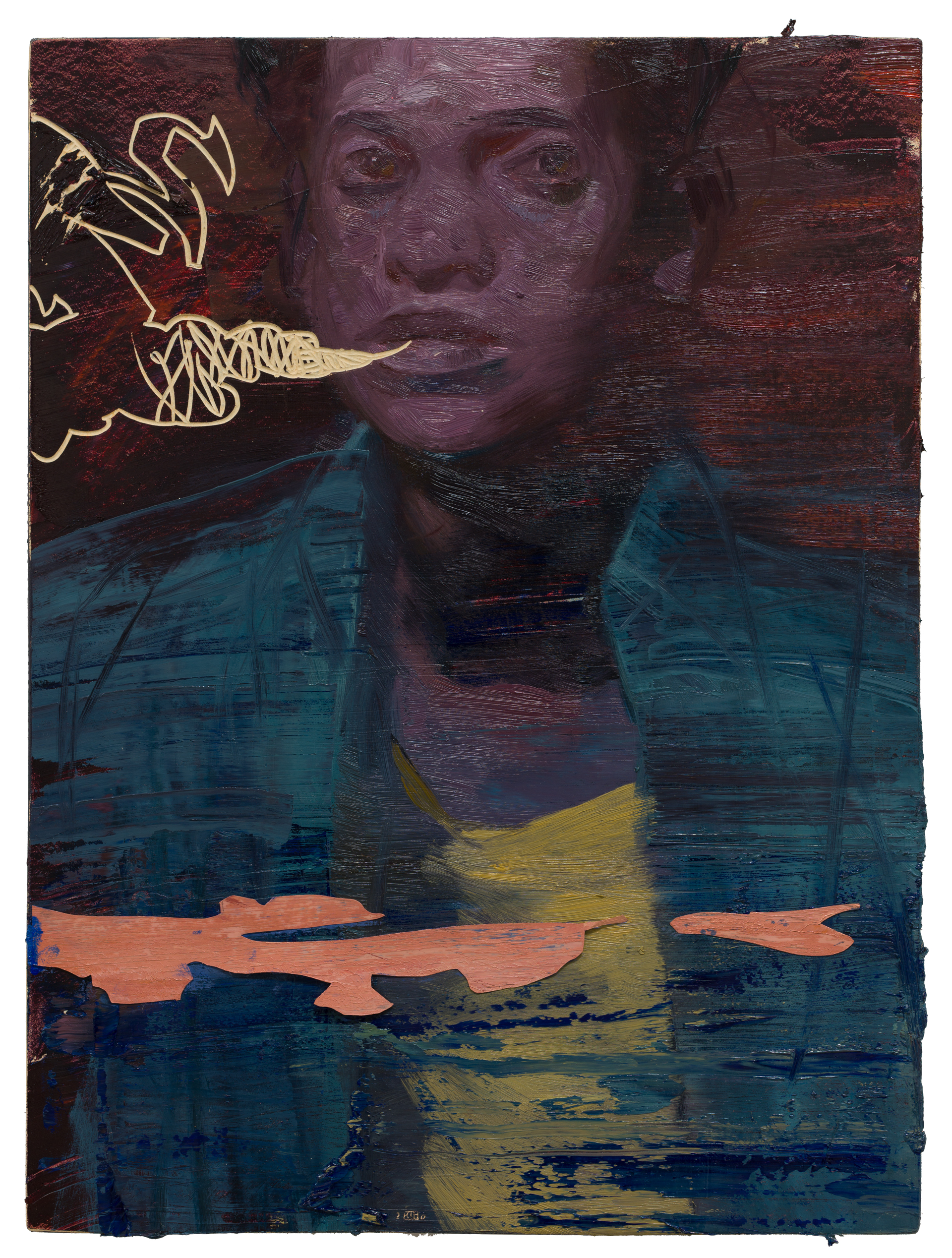
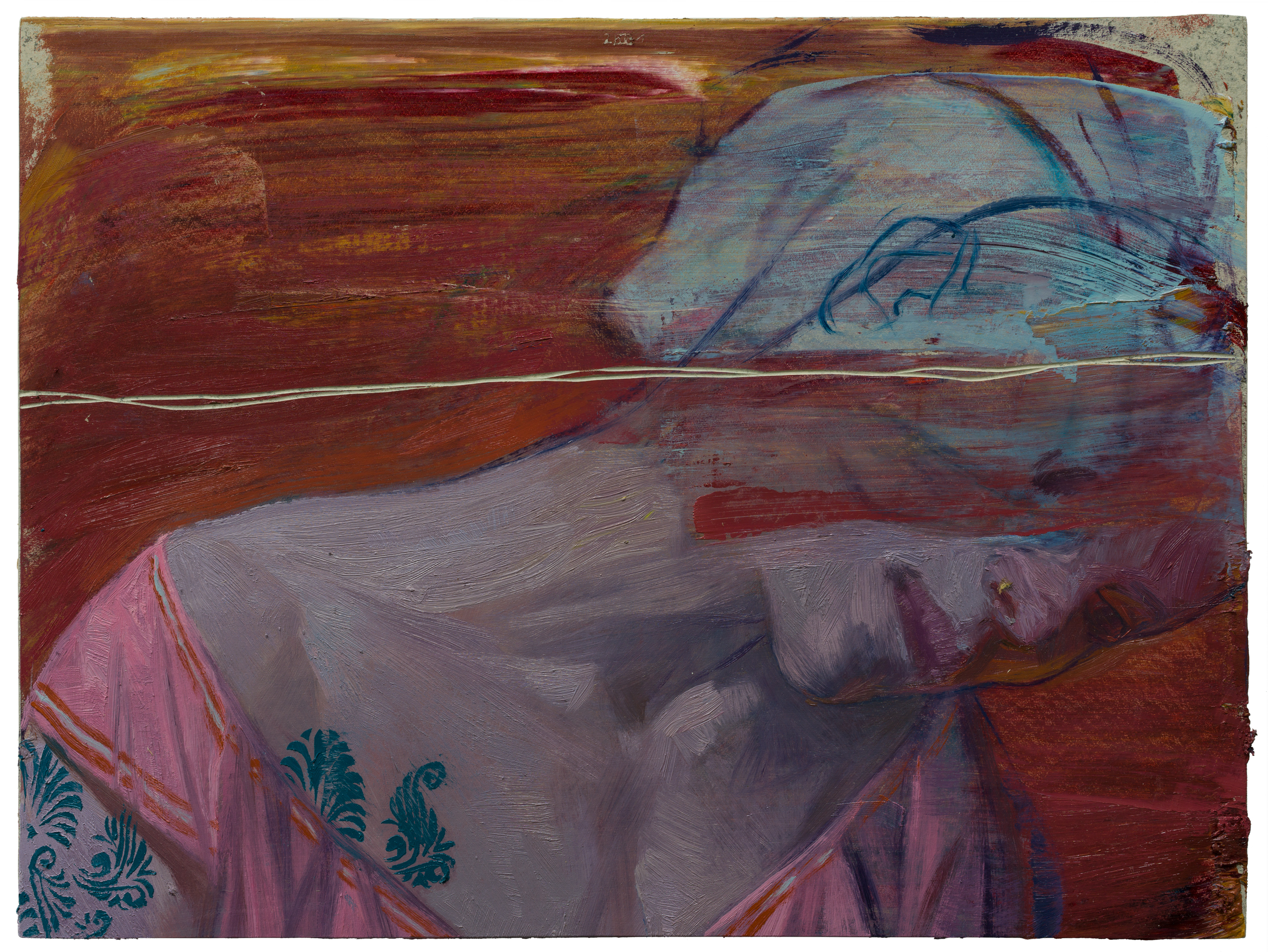
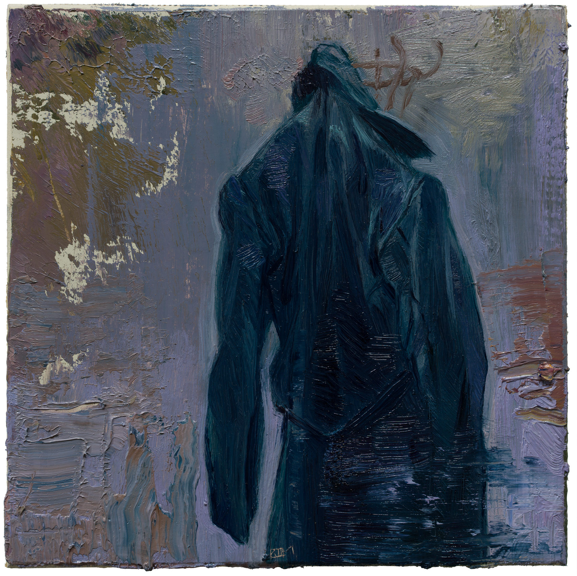
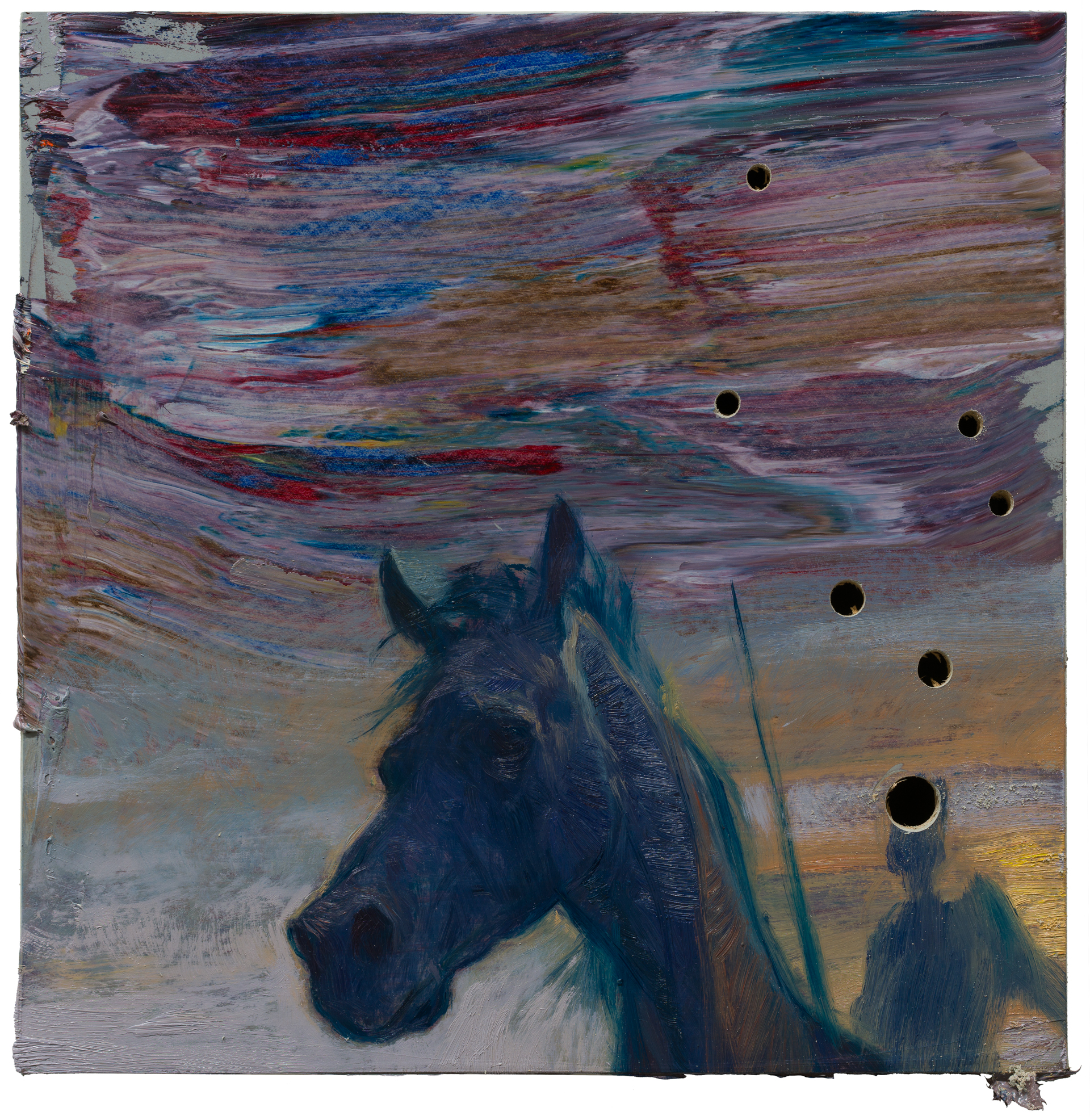
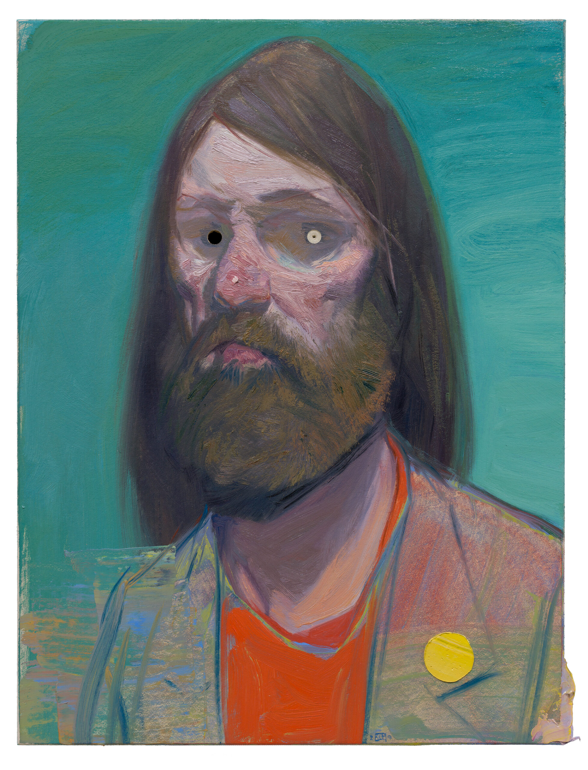
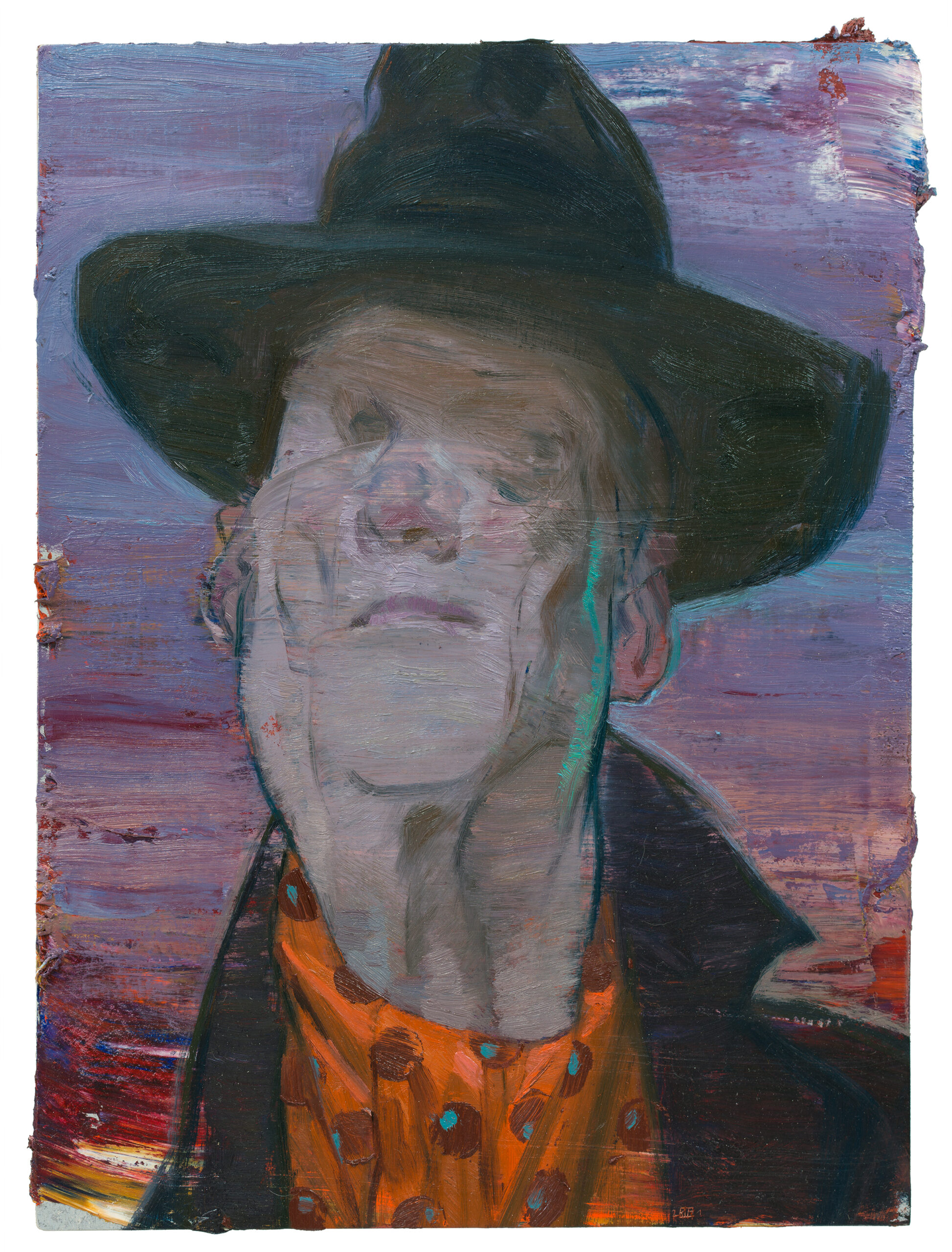
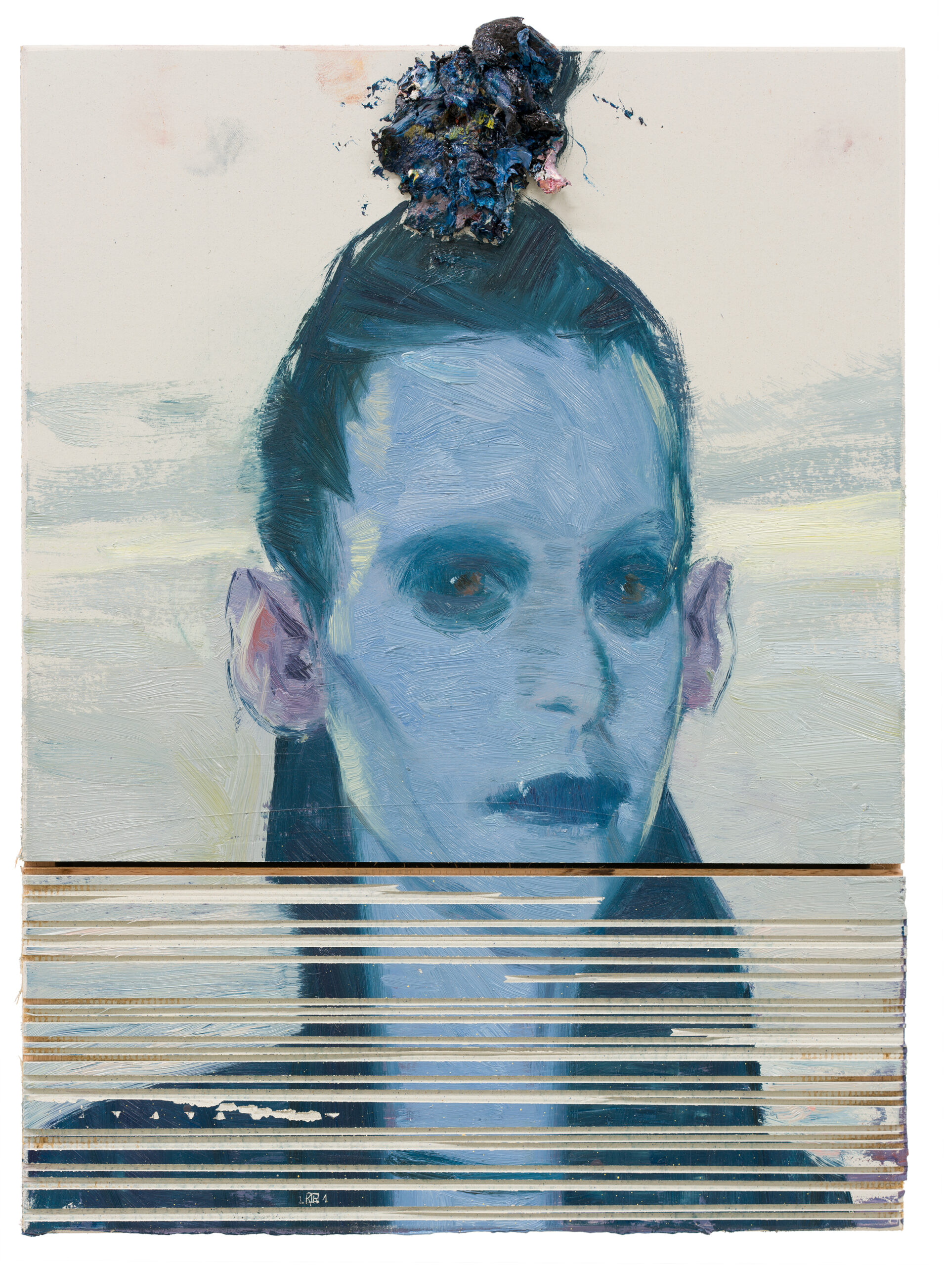
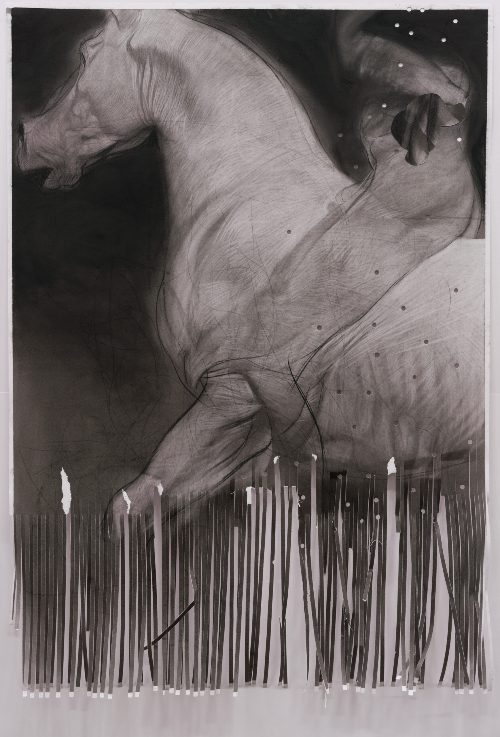
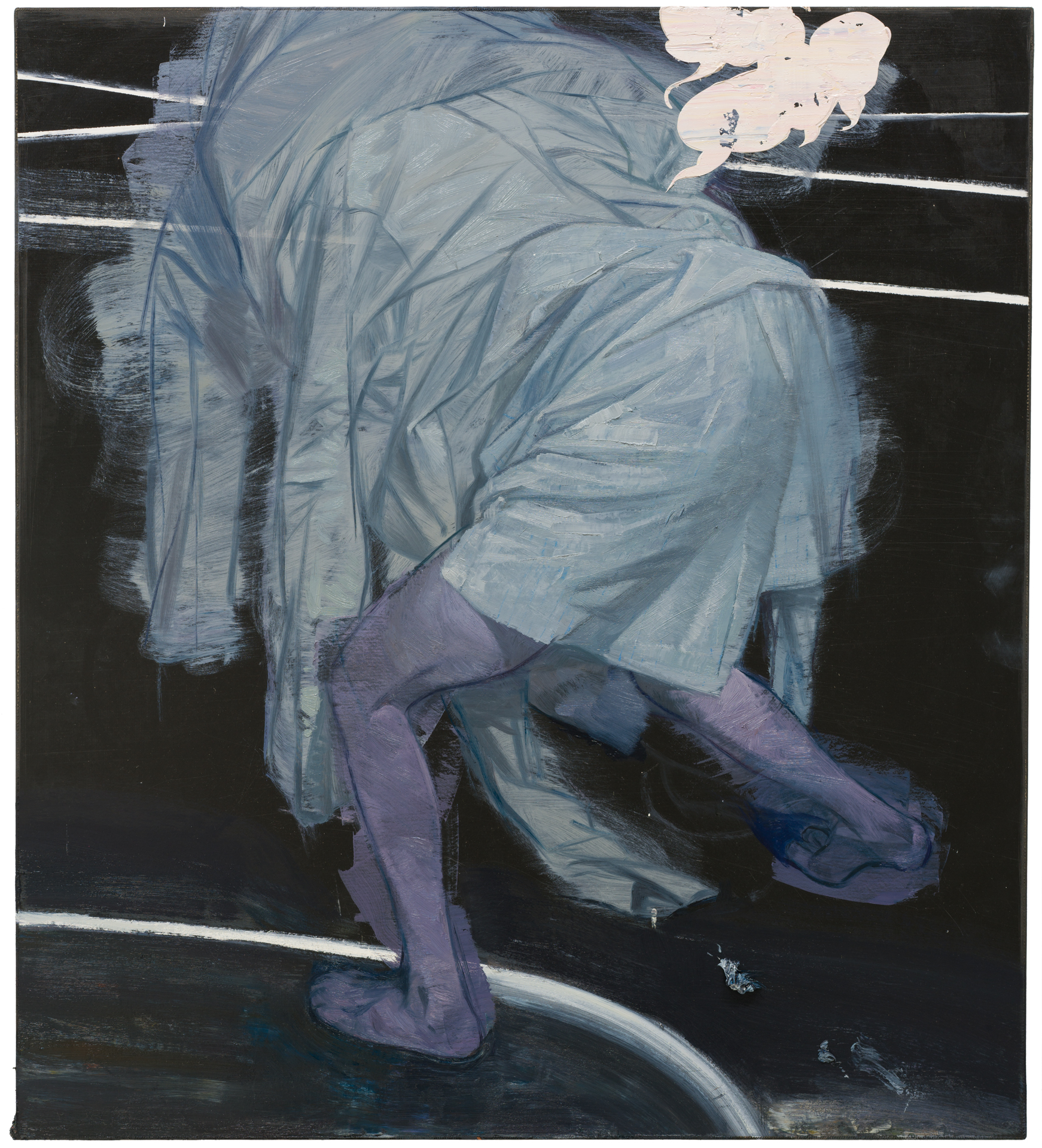
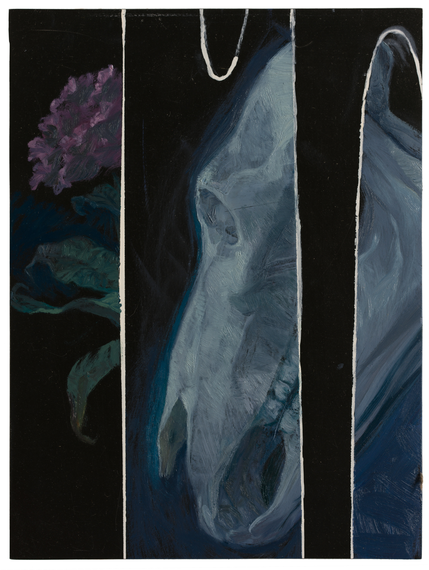
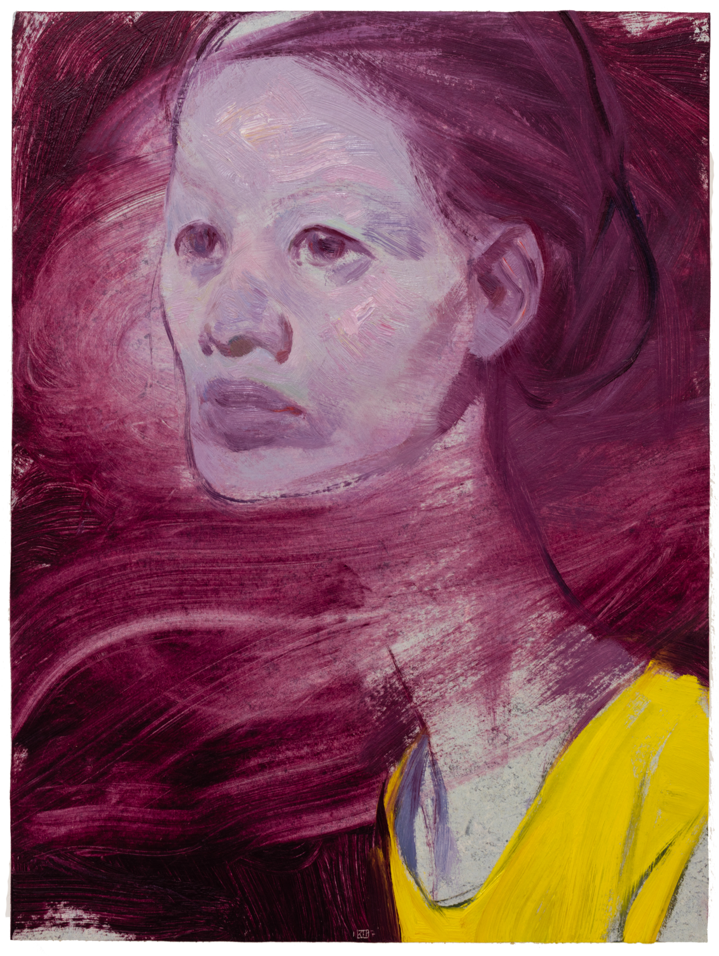
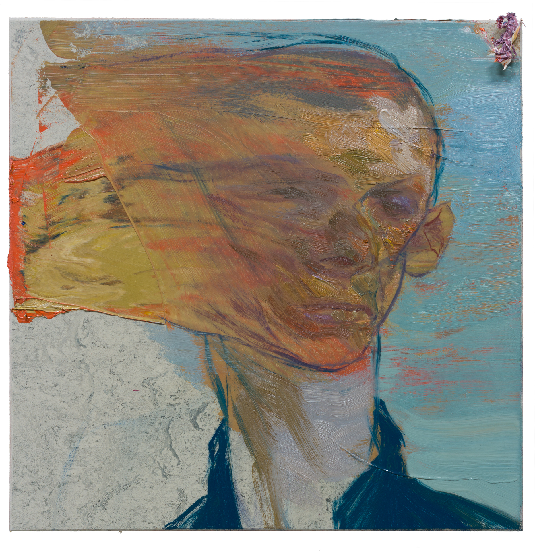
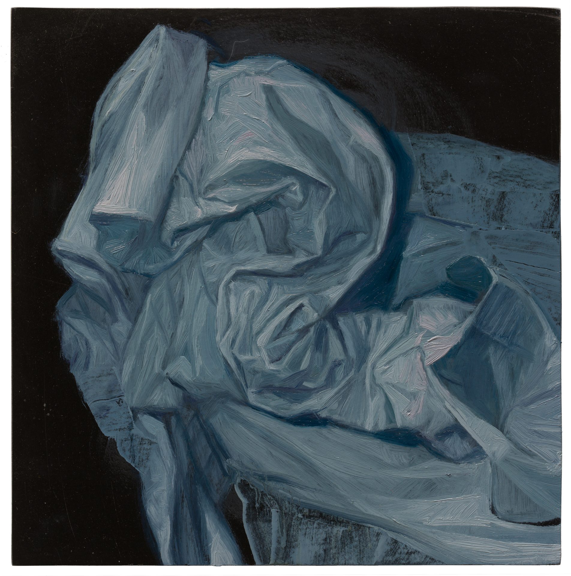
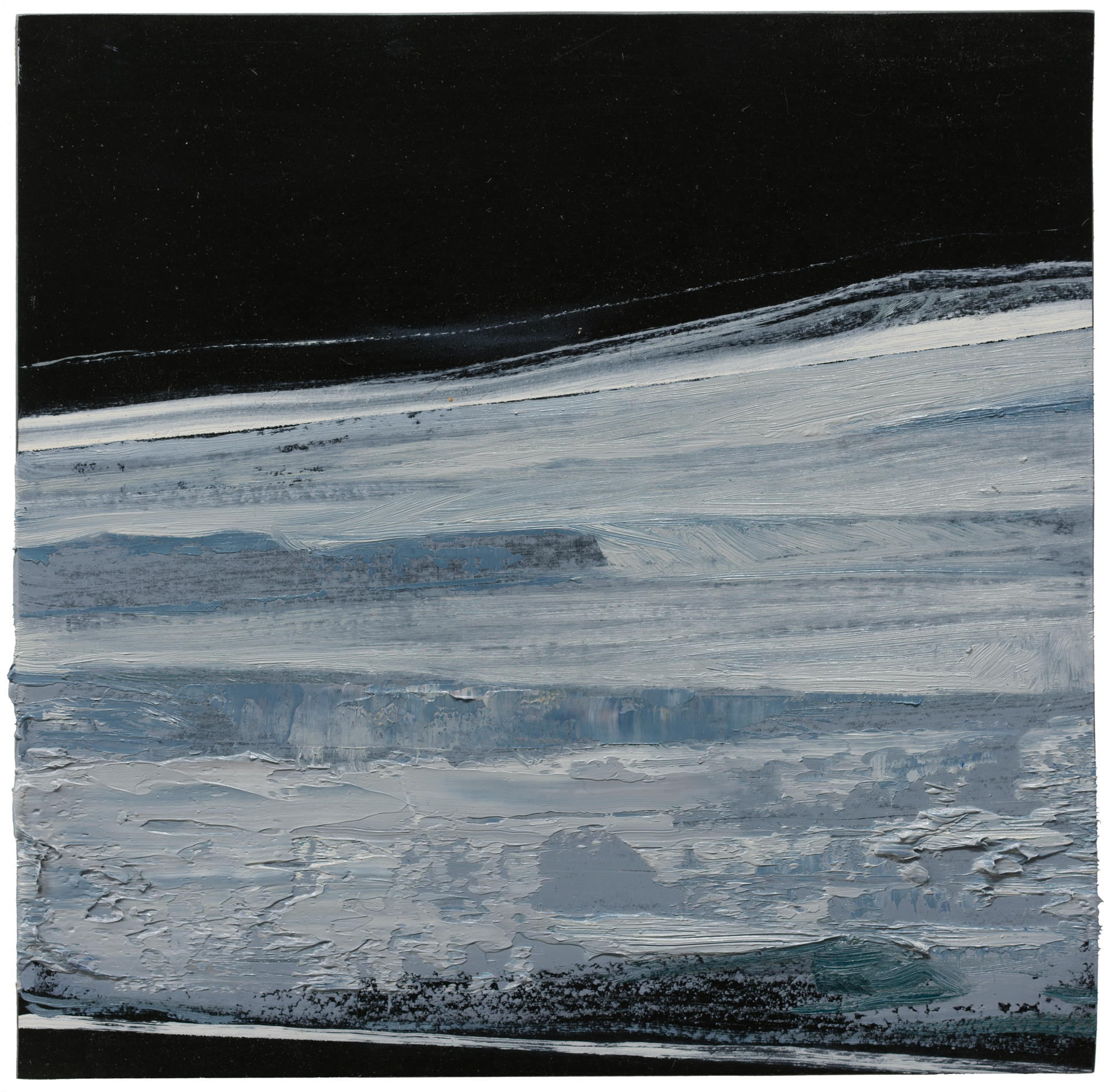
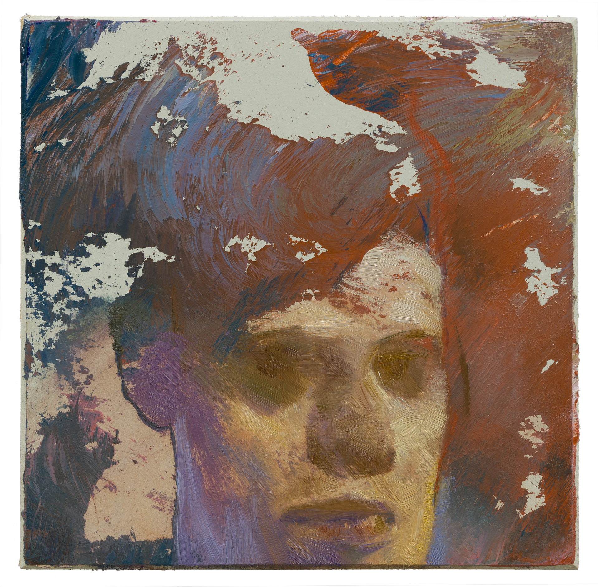
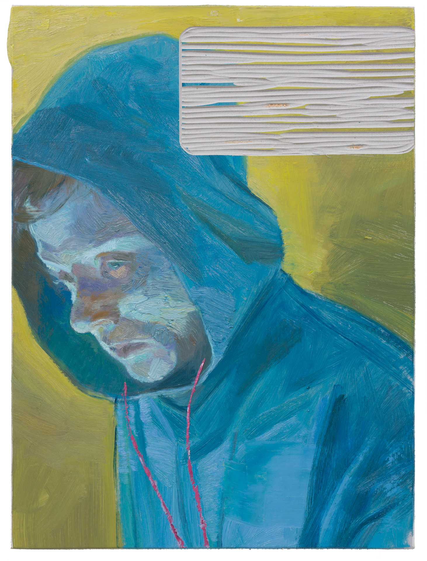
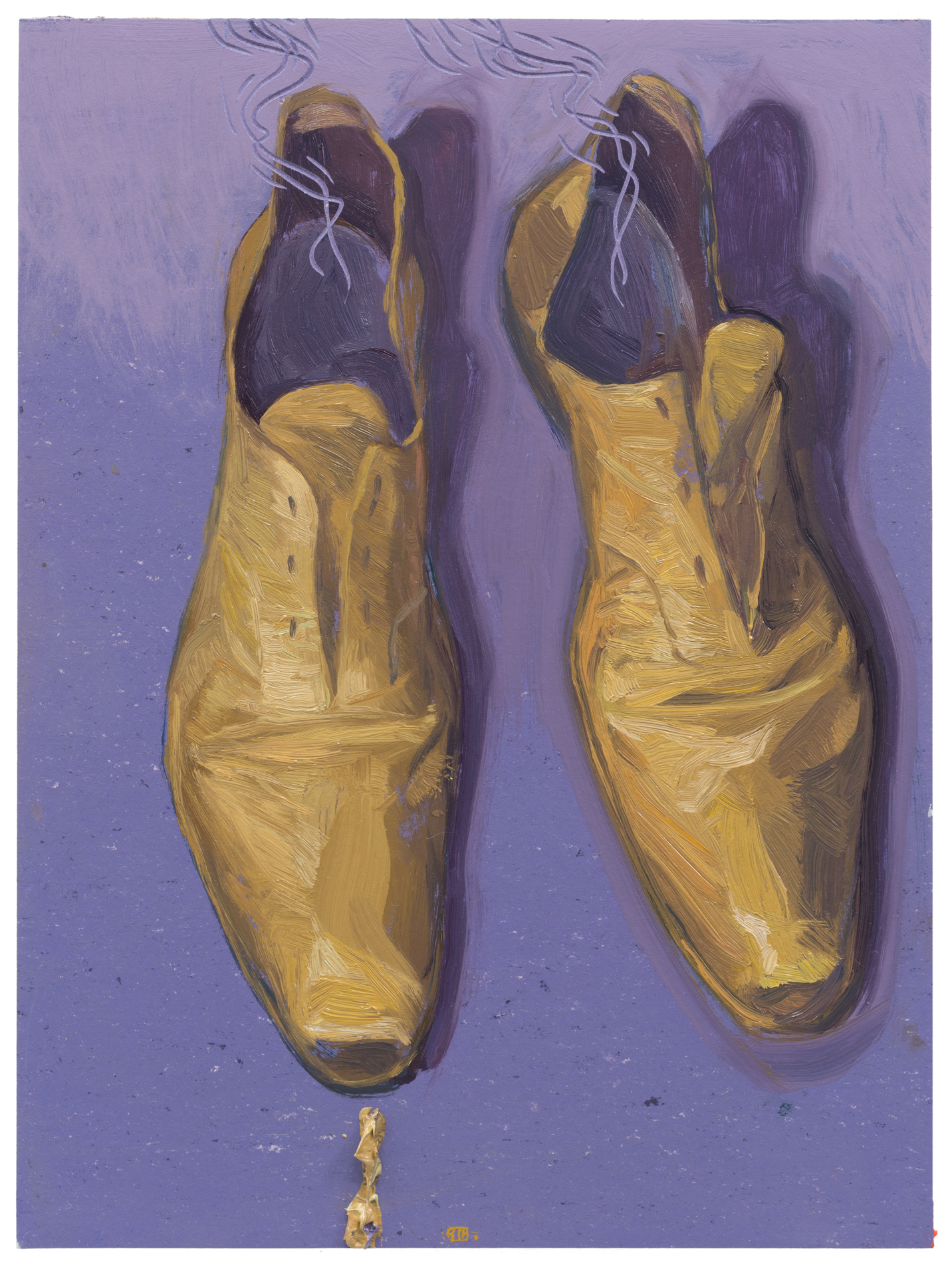
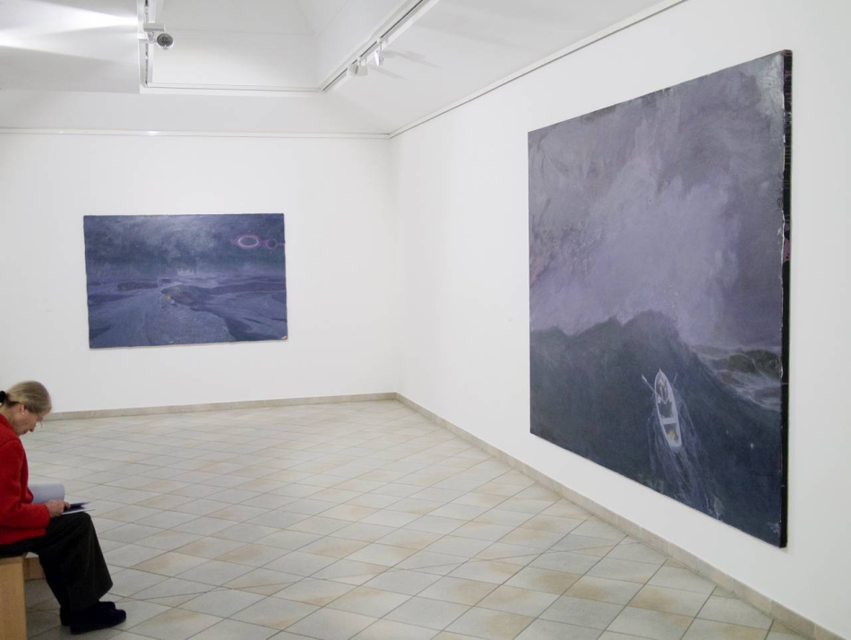
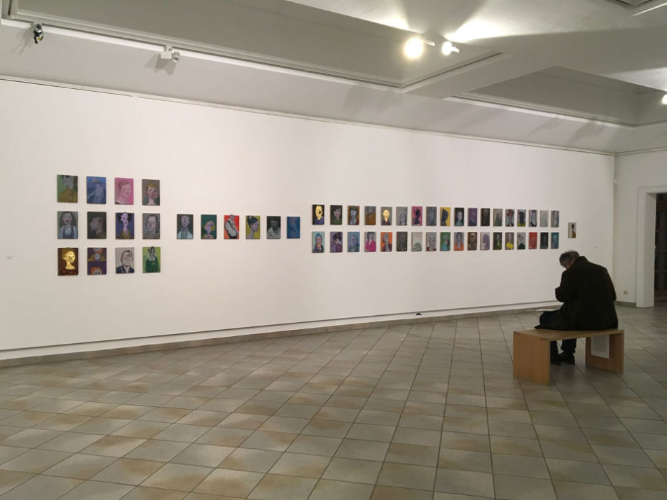
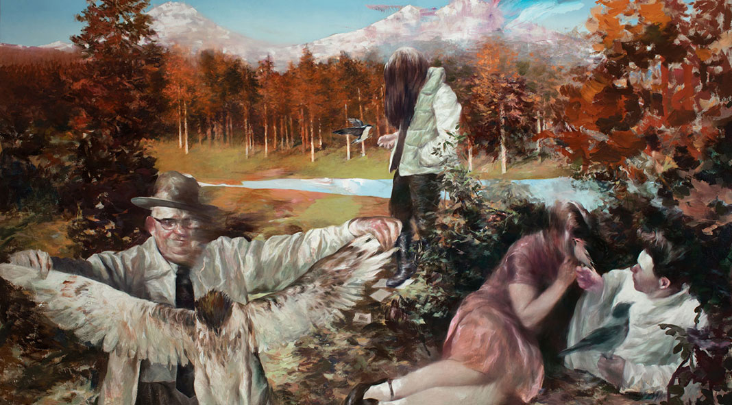
Ruprecht von Kaufmann uses oil paints to create works, including paintings, sculptures and works on paper. His creations are inspired by life experiences.More often, he uses reading literature, music, and movies to trigger various images and imaginations in his mind. Movies are particularly influential. In comparison to the temporal narrative and interweaving voices found in film, painting is a static medium. Kaufmann introduces a division between the before and after in his paintings, thereby unlocking more possibilities for expression. He anticipates that viewers, guided by the composition of the images, will experience strong emotional reactions. Painting, as the result of a series of continuous decisions, simultaneously bears the weight of unexpected imagery. His works often feature repeatedly thickly applied and blurred faces, alluding to unrestricted and open-ended character representations. Although adept at observing and capturing human figures, Kaufmann does not create traditional "portraits"; the faces depicted do not represent specific individuals but rather embody archetypal figures. Through the continuity of low saturation and subdued colors, Kaufmann excels at capturing profound personal moments and individual vulnerability, hinting at a universal human experience.
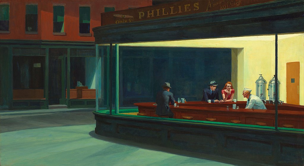
Figurative Art refers to works whose images are based on objects from the real world, incorporating various recognizable elements while infusing the artist's perspectives and thoughts. In contrast to classical portraiture, Francis Bacon's Figurative Art, influenced by Greek classical tragedy, expresses the cruelty, violence, and fear inherent in human nature. The contorted facial features in Bacon's works convey a sense of vanished and unbalanced states, depicting the haunting souls of the walking dead. In Kaufmann's restrained and delicate approach to Figurative Art, he employs an open and humorous style to portray the contradictions and losses of contemporary individuals. His creations seamlessly blend surrealism with absurdity, addressing themes of personal alienation and loneliness. Contrasting with Edward Hopper's 1940s paintings depicting tranquil scenes, individuals in windows, gas stations, and restaurants are depicted in contemplation, experiencing a sense of mutual alienation. Similarly, contemporary Norwegian artist Lars Elling's depiction of a fantastical world where reality and illusion intertwine presents incomplete experiences of the surrounding environment, with elusive shadows reappearing. In the realm of classic literature, Albert Camus's Absurdism creates a sense of solitude, spiritual alienation, and the absurd reality where humanity is powerless to do both good and evil. Alternatively, David Lynch, a contemporary film auteur, with his eerie and surreal style, crafts dreamlike imagery. Like other creators spanning eras, Kaufmann's storytelling prowess, coupled with a style rich in dark humor and intense melancholic hues, reflects our behavior, thoughts, and emotions in the turbulent and uncertain contemporary society.

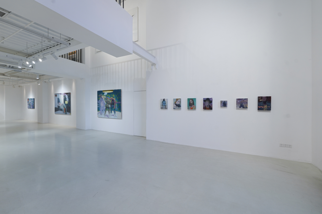
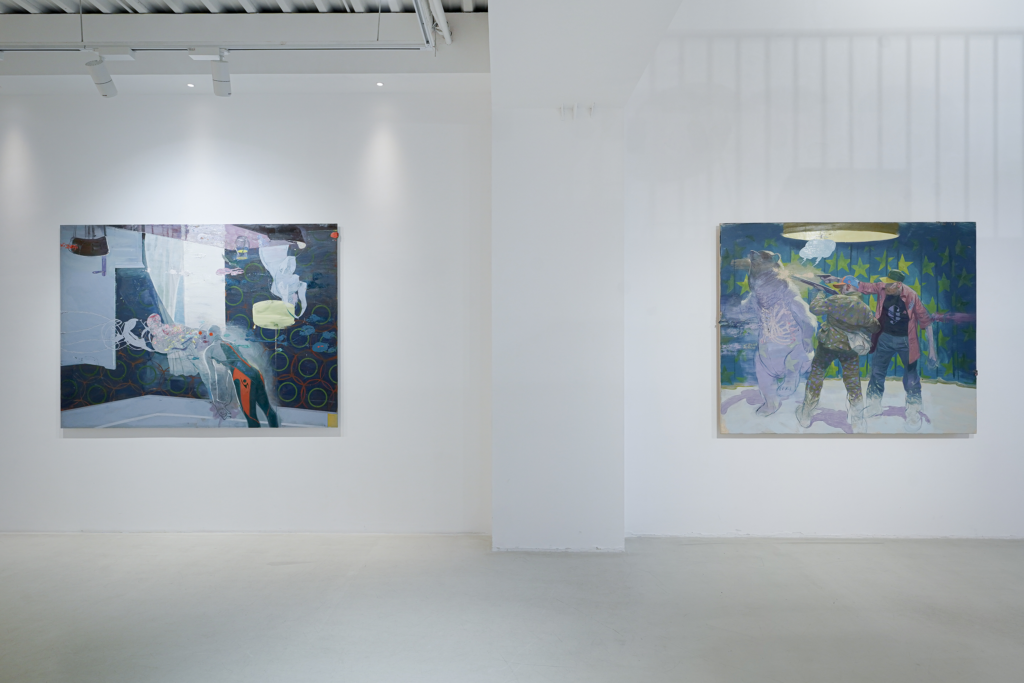
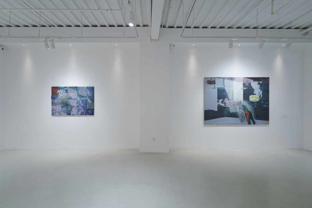
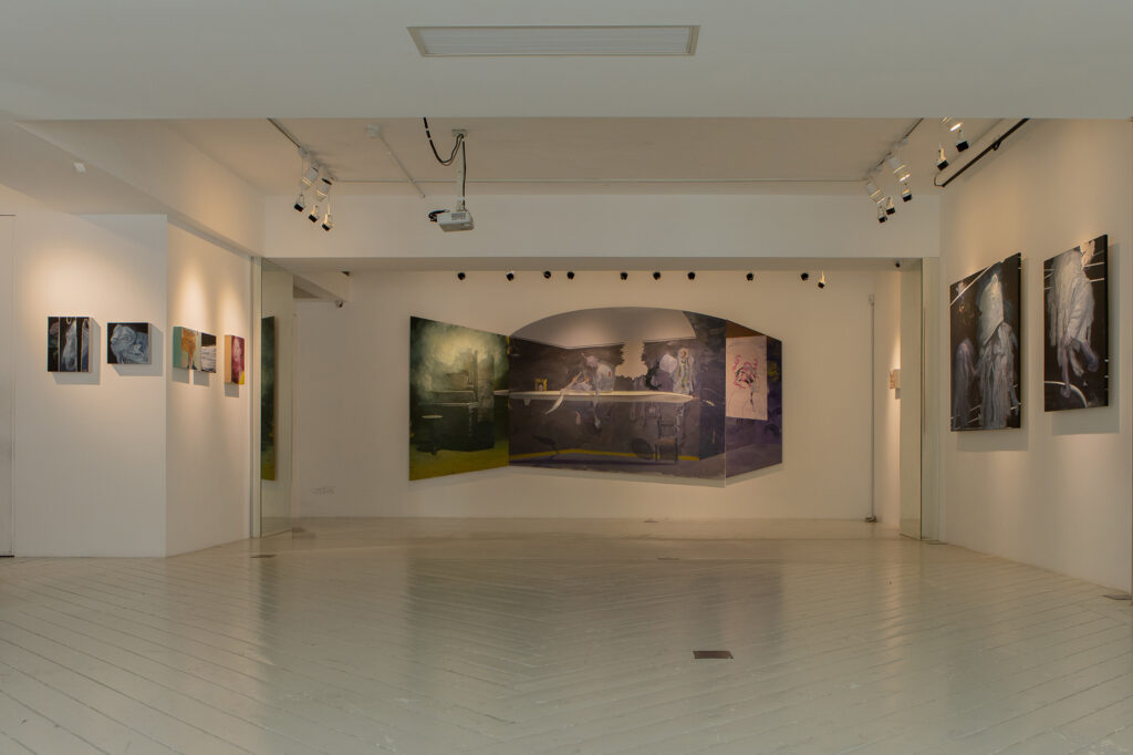
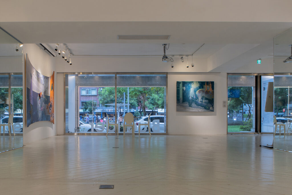
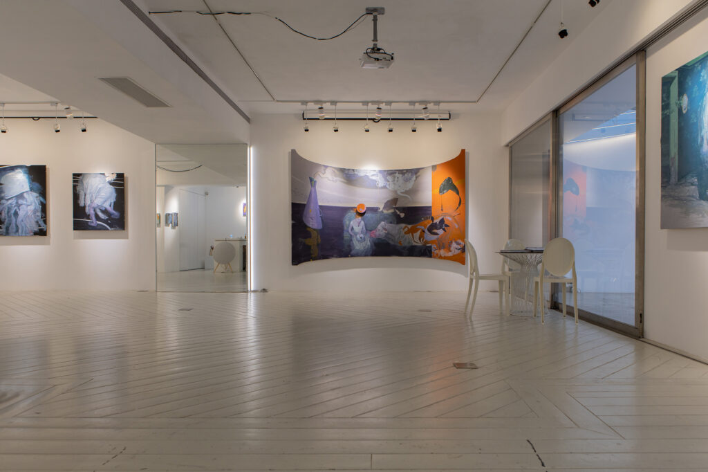
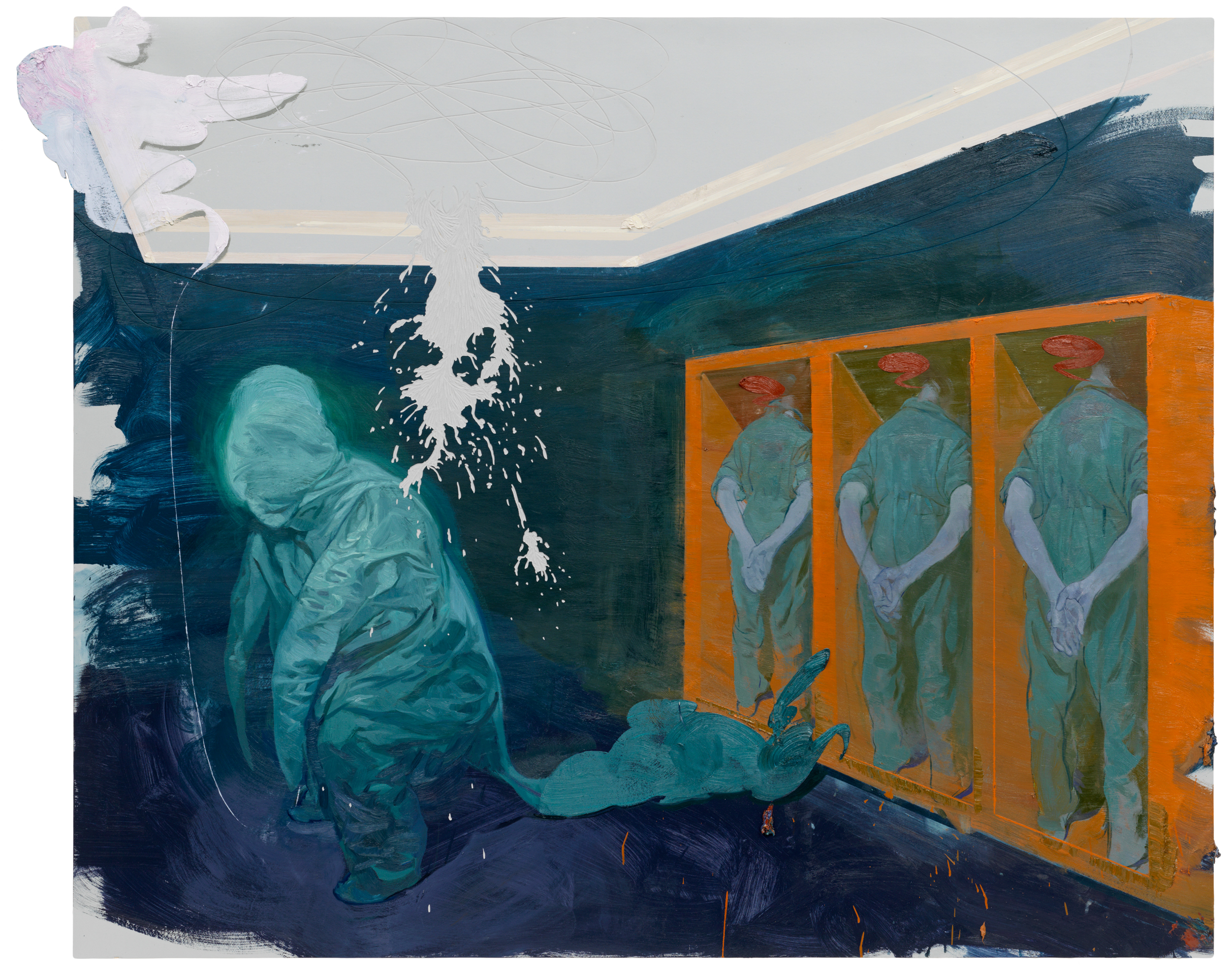
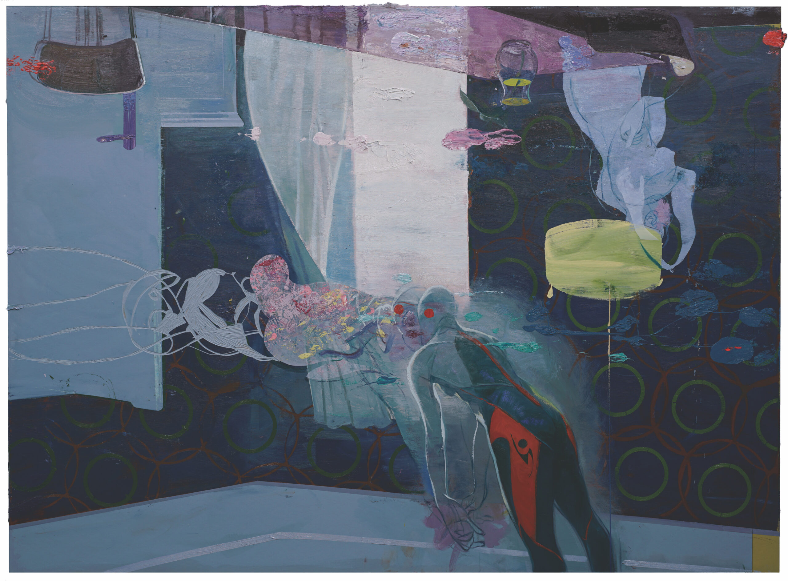
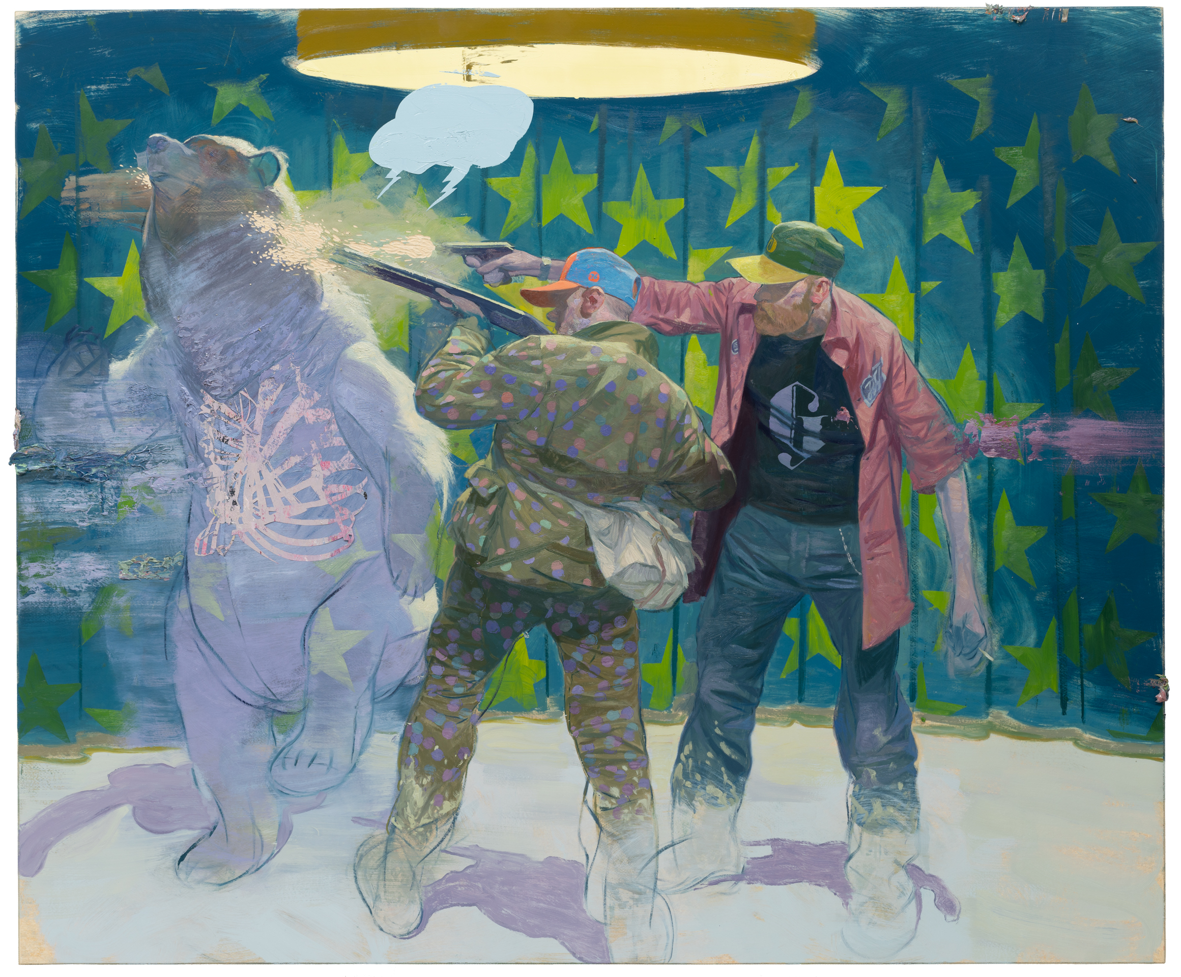
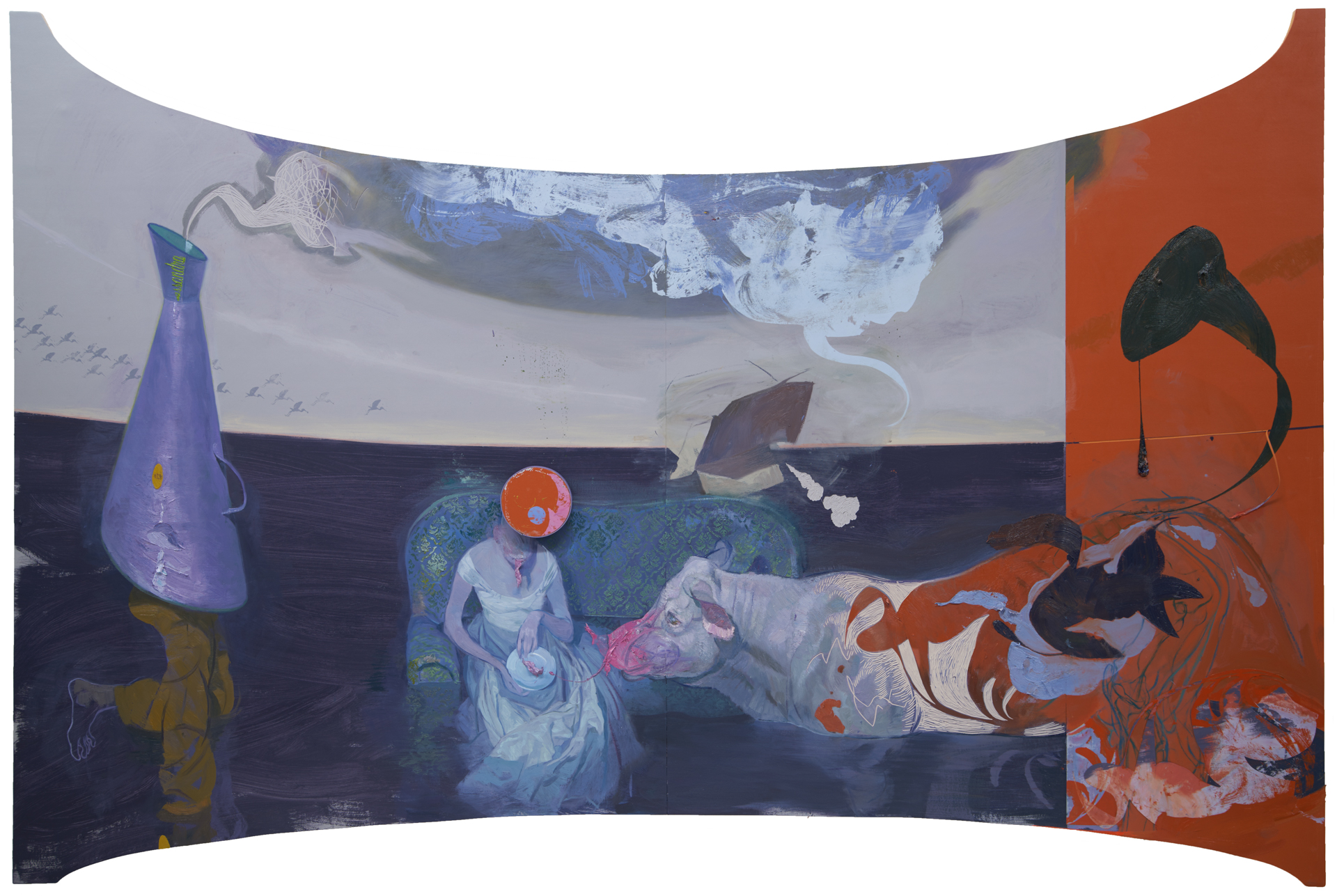
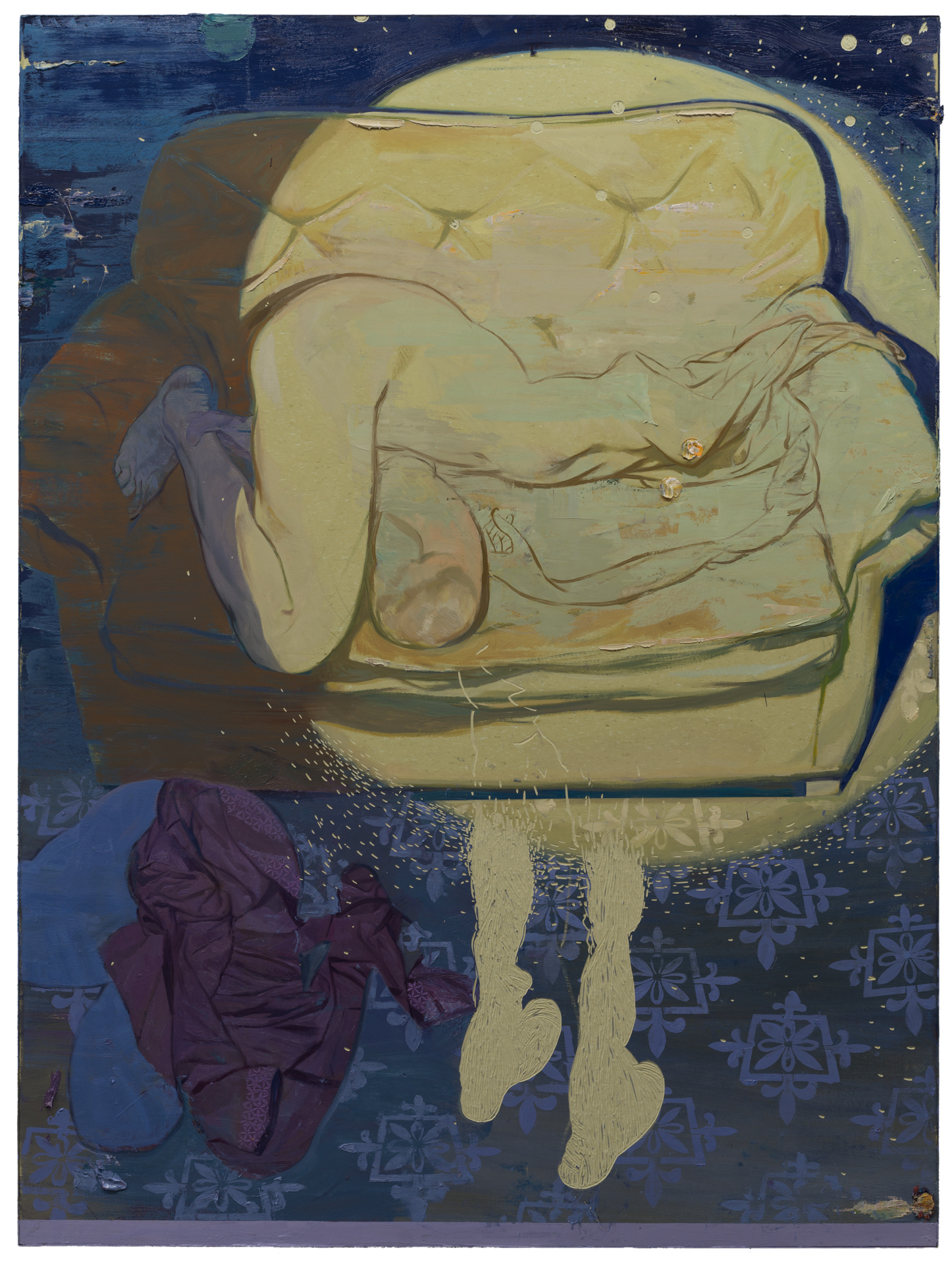
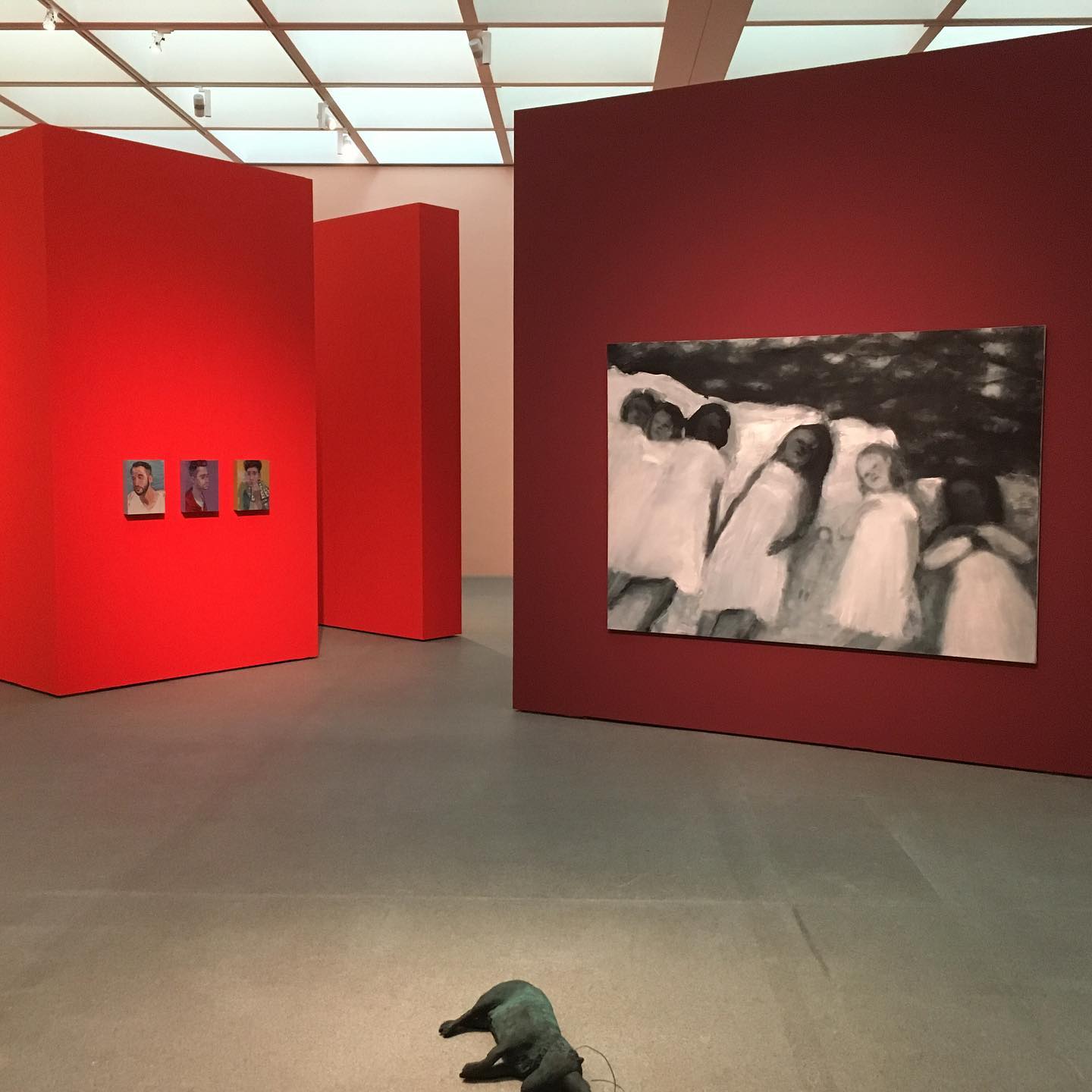
In 2022 and 2023, Kaufmann held solo exhibitions at Bluerider ART Taipei·DunReni and Bluerider ART Shanghai·The Bund, exhibit a series of representative works. Large-scale pieces such as "State of the art" (2015) and "Precious" (2015) draw inspiration from classical painting's refined compositions, unfolding a series of magical and realistic objects and figures that create a poetic atmosphere reminiscent of midnight. The work "Die Gefahrten" (2015) draws inspiration from Homer's epic poem "The Odyssey," symbolizing the artist's journey of seeking ideals, belonging, and self-expression through the ten-year wandering of the Greek hero Odysseus. The piece uses the figure of the "companion" stored in the cabinet as a metaphor for the role of the companion in the hero's story, creating a contrast and advancing the narrative. For example, in "The Odyssey," without companions rowing, Odysseus wouldn't have been able to resist the enchanting song of the Sirens. The artwork "Lying on the Sofa" (2016) narrates the artist's childhood experience of lying on the sofa, gazing at the ceiling, and imagining an inverted world. By creating familiar yet unsettling scenes, it introduces a new perspective, similar to the diver floating in an inverted room, making it challenging to discern the scene. Finally, "Die Wild West Show" (2019) explores the myth of the American Wild West, addressing humanity's excessive exploitation and reckless destruction of natural resources. Using the image of a strong and independent hunter, the artwork packages human greed, selfishness, and culpability, prompting introspection.
Solo Exhibitions
2023 Leben zwischen den Stühlen´, Buchheim Museum, Bernried
2022 In the Street´, Kristian Hjellegjerde Gallery, London
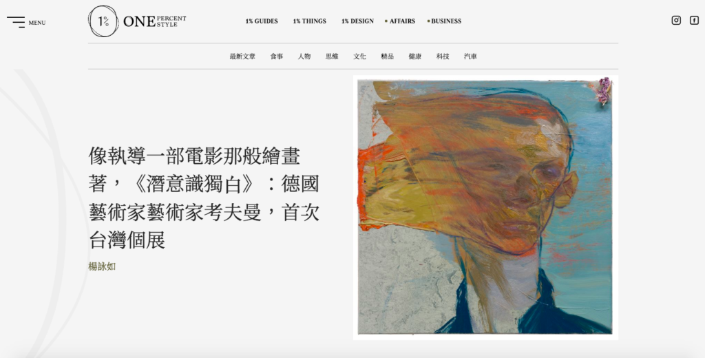
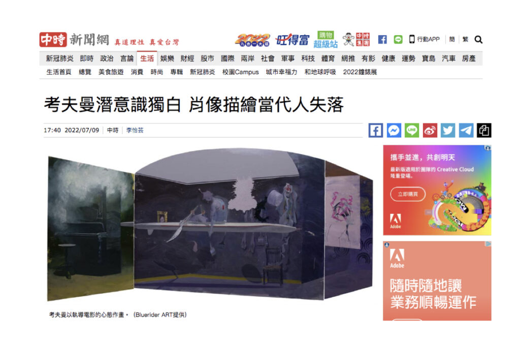
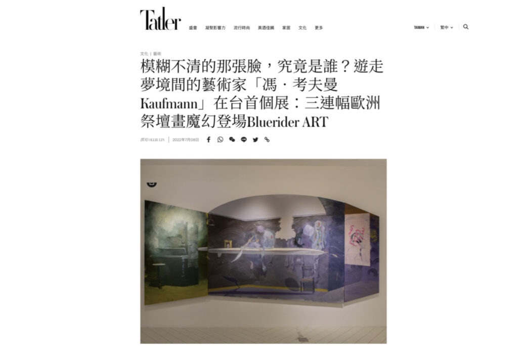
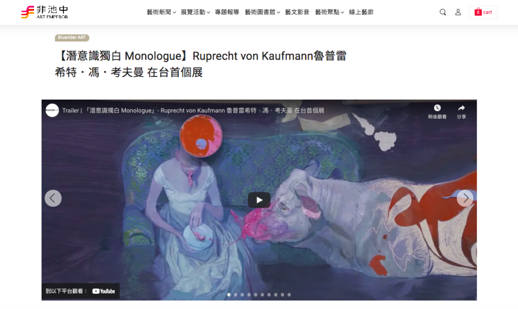
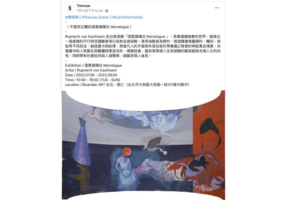
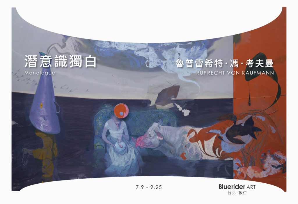
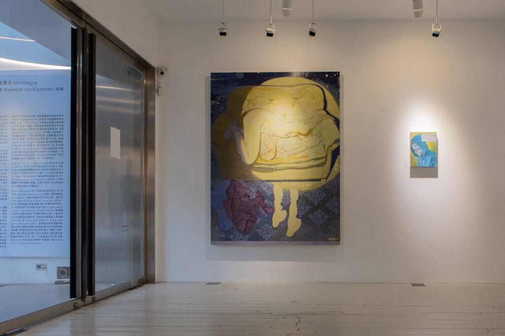
2022 Monologue, Bluerider ART, Taipei, Taiwan
2021 Just Before Dawn´, Galerie Thomas Fuchs, Stuttgart
2021 Dreamscapes´, Cermak Eisenkraft Gallery, Prag
2020 The Three Princes of Serendip´, Kristin Hjellegjerde Gallery, London
2020 Inside the Outside´, City Gallery Gutshaus Steglitz, Berlin
2019 Inside the Outside´, UN Headquarters, New York
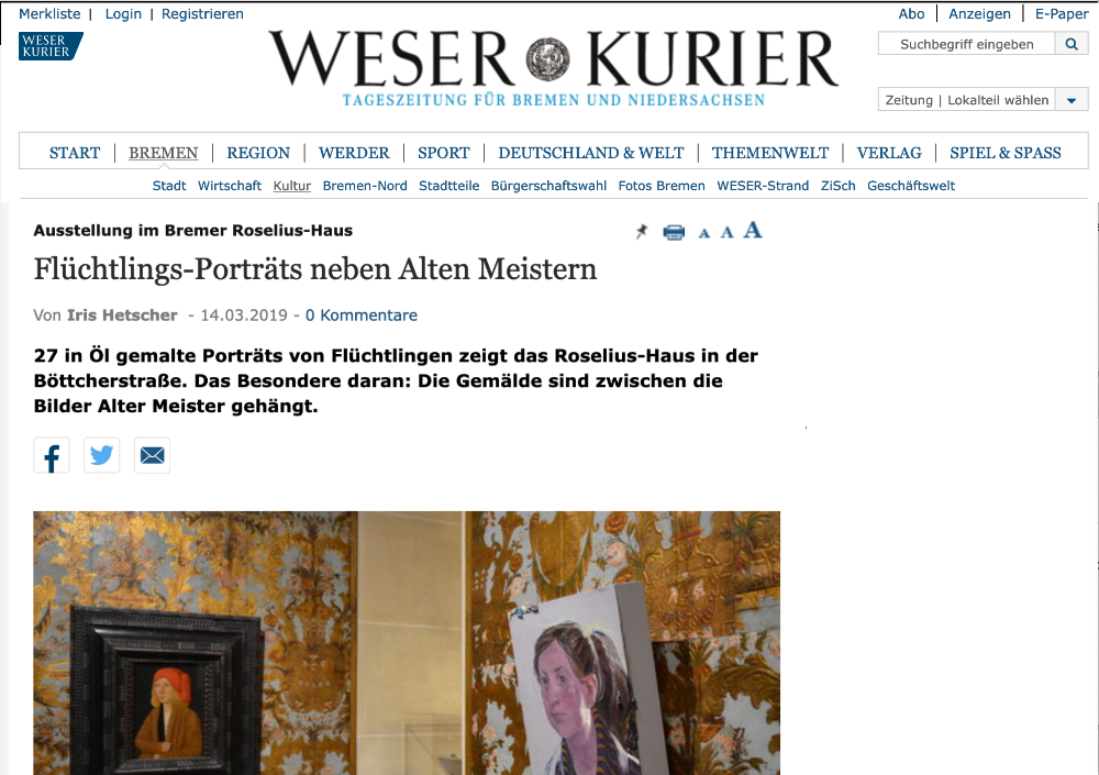
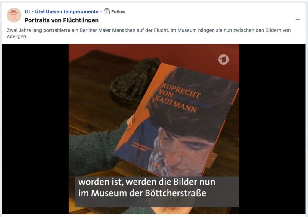
2019 Inside the Outside´, Museen Böttcherstrasse, Bremen
2019 Die drei Prinzen von Serendip´, Kunstsammlung Neubrandenburg, Neubrandenburg
2019 Die Augen fest geschlossen´, Galerie Thomas Fuchs, Stuttgart
2018 Die Evakuierung des Himmels´, Kunsthalle Erfurt, Erfurt
2018 Liederbuch´, Galerie Thomas Fuchs, Stuttgart
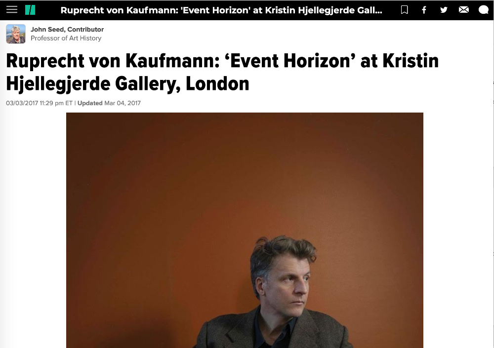
2017 Event Horizon´, Kristin Hjellegjerde Galelry, London
2016 The God of Small and Big Things´, Galerie Crone, Berlin
2016 Phantombild-Blaupause´, Nordheimer Scheune, Nordheim, Germany
2015 Grösserbesserschnellermehr´, Forum Kunst, Rottweil
2014 Fabel´, Georg Kolbe Museum, Berlin
2014 Carna(va)l´, Museum Abtei Liesborn, Liesborn
2013 Die Nacht´, Junge Kunst e.V. Wolfsburg
2013 Die Nacht´, Galerie Rupert Pfab, Düsseldorf
2012 Der Ozean´, Galerie Christian Ehrentraut
2011 Altes Haus´, Galerie Rupert Pfab, Düsseldorf
2011 Zwischenzeit´, Neue Galerie Gladbeck, Gladbeck
2010 Äquator Teil I´, Galerie Christian Ehrentraut, Berlin
2010 Herr Lampe´, Bundesbank, Frankfurt
2009 Nebel´, Galerie Christian Ehrentraut
2009 Halbmast´, Philara Collection, Düsseldorf
2008 Ruprecht von Kaufmann´, Galerie Rupert Pfab, Düsseldorf
2007 Eine Übersicht´, Konrad-Adenauer-Foundation, Berlin
2006 Bathosphere´, Ann Nathan Gallery, Chicago
2006 Bathosphere´, Kunstverein Göttingen
2006 Als mich mein Steckenpferd fraß´, Galerie Christian Ehrentraut, Berlin
2005 Bildwechsel´, Galerie Christian Ehrentraut, Berlin
2005 Neue Zeichnungen´, Kunstschacht Zeche Zollverein, Essen
2003 `Of Faith and Other Demons´, Claire Oliver Fine Arts, New York
Group Exhibitions
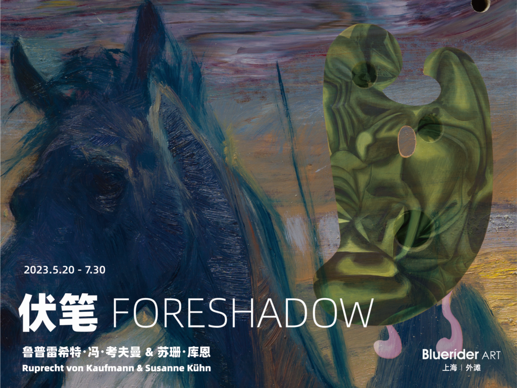
2023 Foreshadow, Bluerider ART Shanghai, Shanghai, China
2022 `On the Wall´, Building Gallery, Mailand
2022 `Das Eigene im Fremden – Einblicke in die Sammlung Detlev Blenk´, Museum Bensheim
2021 `Gefühle r(aus)! Global Emotion´, Motorenhalle, Dresden
2020 `Neue Wilde und Andere aus der Sammlung Stefan Neukirch´, Coesfeld
2019 `Feelings´, Pinakothek der Moderne, Munich, Germany
2019 `Metaphysica´, Haugar Art Museum, Tønsberg, Norway
2019 `Birkholms Echo´, Faaborg Museum of Art, Faaborg, Denmark
2018 `Contemporary Chaos´, Vestfossen Kunstlaboratorium, Vestfossen, Norway
2018 `Schwarze Romantik´, Künstlerhaus Thurn & Taxis, Bregenz, Topicuv Salon, Prague
2017 `Ecce Creatura´, Kallmann Museum, Ismaning
2017 `Paintingguide NYC´, Booth Gallery, New York, USA
2017 `Schwarze Romantik´, Bukarest, Berlin, Backnag, Bregenz, Prag
2016 `Wahlverwandschaften, German Art since the late 1960s´, National Museum of Latvia, Riga
2016 `Prozac´, Kunstverein Glückstadt, Glückstadt, Germany
2015 `The Vacancy´, Friedrichstr., Berlin
2015 `Kunst Wollen?´, openAEG, Nürnberg
2015 `Du sollst Dir (k)ein Bild machen´, Berliner Dom, Berlin
2015 `Time Lies´, KinoInternational, Berlin
2014 `The Sea´, Brandts Museum, Odense
2014 `Revolution´, Rohkunstbau, Roskow
2014 `Waffensichten´, Museum Galerie Dachau, Dachau
2014 `Malerei am Rand der Wirklichkeit´, Haus am Lützwoplatz, Berlin
2013 `Tierstücke´, Museum Abtei Liesborn
2013 ‘Alles Wasser’, Galerie Mikael Anderson, Copenhagen
2013 ‘Weltenschöpfer’, Museum für Bildende Kunst, Leipzig
2012 `Convoy Berlin´, Bzarsky Gallery, Budapest
2011 `I am a Berliner´, Tel Aviv Museum, Israel
2010 `Werkschau I der Erwine Steinblum Stipendiaten´, Kunst:raum Syltquelle, Rantum / Sylt
2009 `Menschenbilder 1620/2009´, Museum Hoexter-Corvey, Hoexter
2008 `Daydreams & Dark Sides´, Künstlerhaus Bethanien, Berlin
2007 `Stipendiatenausstellung´, Konrad-Adenauer-Foundation, Berlin
2006 `Full House´, Kunsthalle Mannheim
2006 `Gletscherdämmerung`, Eres Stiftung, München
2003 `RePresenting Representation VI´, Arnot Art Museum, New York
2002 `The Perception of Appearance´, The Frye Art Museum, Seattle
2001 `Representing LA´, The Frye Art Museum, Seattle, Art Museum of South Texas and Orange County Museum of Art, LA
Publication
Dissonance – Platform Germany, DCV, Texte: Mark Gisbourne, Christoph Tannert, 2022, ISBN 978-3-96912-060-6
Leben zwischen den Stühlen, Distanz, Texte: Dr. Brigitte Hausmann, Daniel J. Schreiber, Sylvia Volz, 2020, ISBN 978-3-95476-354-2
Inside the Outside, Distanz, Maynat Kurbanova, Michele Cinque, 2019, ISBN 978-3-95476-270-5
Maynat Kurbanova, Michele Cinque, Inside the Outside, Distanz
Magdalena Kröner, Frankfurter Allgemeine Zeitung, Kunstmarkt
Robert Hughes, Rolf Lauter, Julia Wallner, Ruprecht von Kaufmann 2005-2006, ISBN 978-3-00-020112-7
Leah Ollman, Los Angeles Sunday Times, ‘Painting a Mirror for Humanity’, 16. Juni 2002
Garrett Holg, Art News, ‘A futurist Manifesto’, Ruprecht von Kaufmann at Ann Nathan Gallery Chicago’, Januar Ausgabe 2002
Collection
Collection of the Federal Republic of Germany
Collection of the German Bundestag
Collection of the National Bank of the Federal Republic of Germany, Frankfurt
Coleccion Solo, Madrid
Collection Ole Faarup, Kopenhagen
Collezione Coppola, Vicenza
Hort Family Collection, New York
Uzyiel Collection, London
Sammlung Philara, Düsseldorf
Sammlung Hildebrand, Leipzig
Sammlung Holger Friedrich, Berlin
Sammlung Museum Abtei Liesborn, Liesborn
Sammlung Veronika Smetackova, Pragu